Maestro Insights

TEAM
Moran (PM), Emilie (Clinical), Jefferey (CSO), Ritwik (Data), Tapforce (Dev)
ROLE
0→1 Product UX Research AI Design Design System
DURATION
7 months — Jun 2024–Dec 2024

I designed Moon Surgical’s first AI analytics platform from scratch. Surgeons had no way to learn from their robotic procedures. I built a system that turns raw surgical data into insights they actually act on. 58% increase in robot utilization after launch.

View Impact

Maestro Insights Platform — live since December 2024

THE PRODUCT

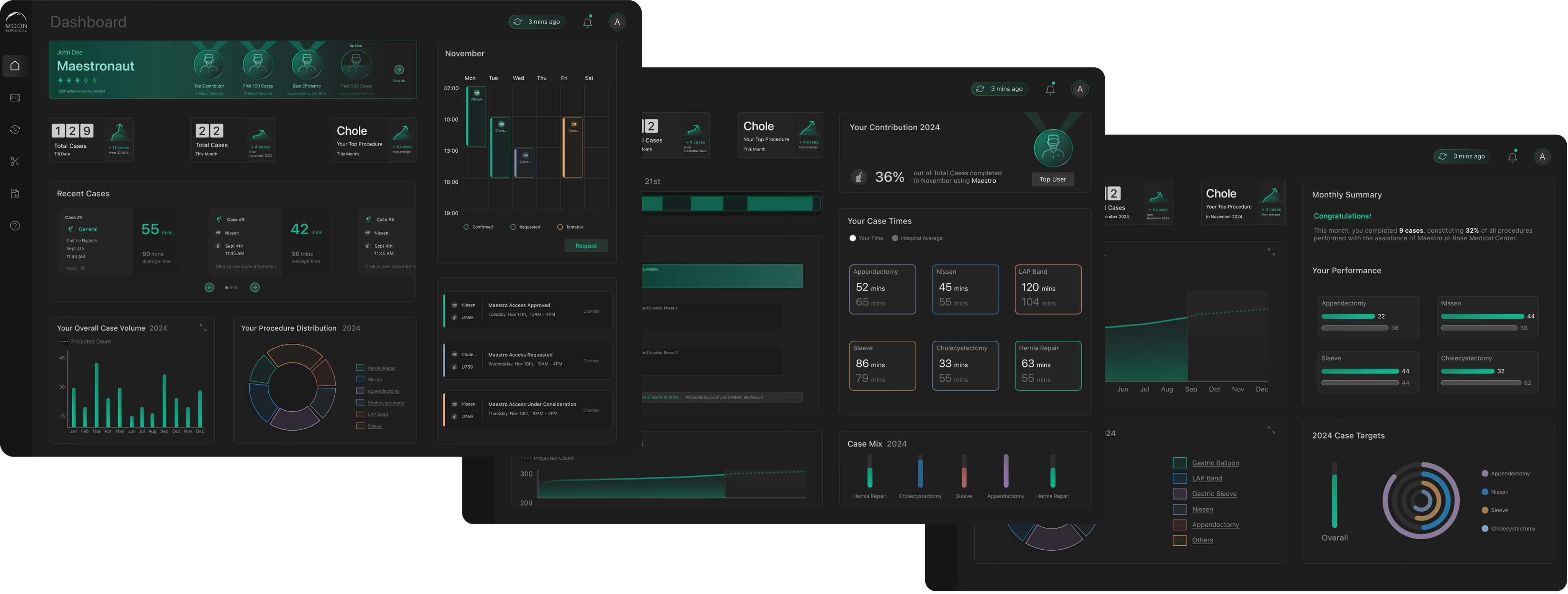
What Surgeons and Admins See

Maestro Insights has two faces: a surgeon dashboard for personal performance, and an admin dashboard for hospital-wide robot management. Both pull from the same data the robot collects during every procedure.
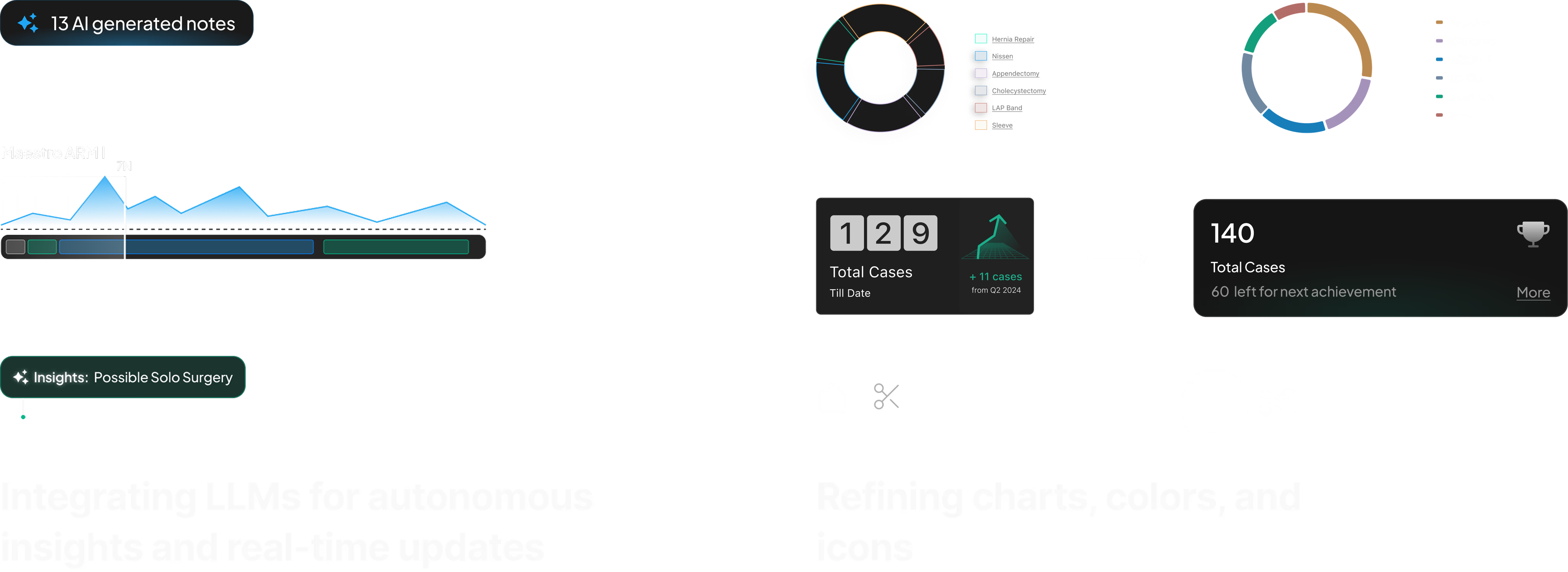
“If something shifted, I’d like to know up front. Just the key signals.”

Trend Cards

The surgeon’s dashboard opens with trend cards that surface changes in their performance KPIs. No digging, no spreadsheets. If your start time improved or your case duration spiked, you see it immediately.

“If I can see how I’ve used the robot over time, I can better understand the value it’s adding.”

Distribution Charts

Interactive charts that show procedure volume over time. Surgeons track whether they’re hitting their targets, and the data updates after every case.

“I need to track case-specific patterns, not just time.”

Recent Cases + AI Synopsis

Each case gets a detailed breakdown: timing, instruments used, staff, and notes. The AI synopsis generates a summary with actionable takeaways. No manual review needed.

Recent cases with timing, staff, and procedure details

Clicking into a case reveals the AI-generated synopsis — an LLM-written summary of what happened, what changed, and what to pay attention to next.

AI synopsis with performance analysis and actionable takeaways

How the AI Works

Every procedure generates hundreds of data points — arm force readings, instrument switches, phase transitions, timing deltas. This raw data flows through our processing pipeline and into an LLM with system prompts tuned to surface what surgeons care about: what changed from their baseline, what took longer than expected, and what to watch next time. I worked with our data scientist to define which metrics mattered and iterated on the prompt structure until the summaries matched the language surgeons actually use in post-op discussions.

Case Intelligence AI notification: procedure time analysis with actionable suggestions

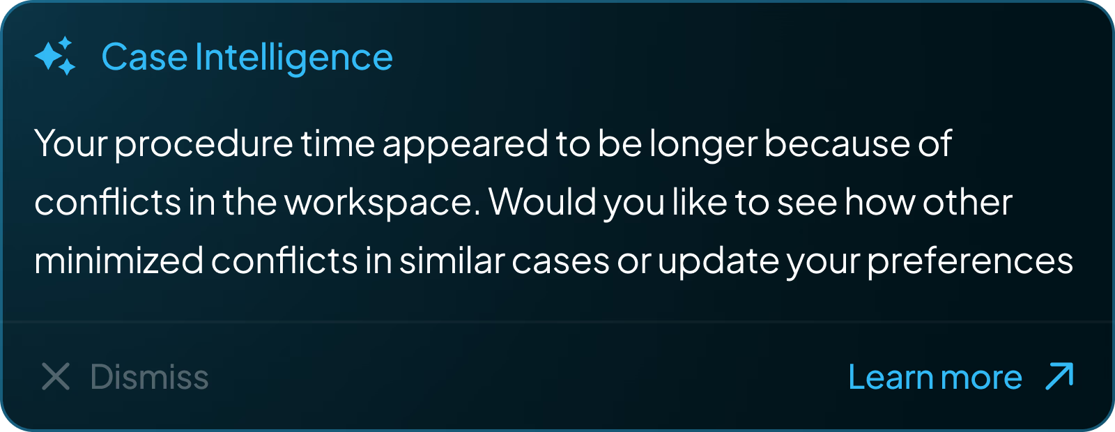
Case Intelligence: proactive AI notifications surfaced after each procedure

Voice AI — “Hey Maestro”

Surgeons can’t type notes during a procedure. I designed a voice interface: say “Hey Maestro” and speak. There’s no screen UI for this — it’s an OR environment. Instead, the robot’s RGB strip pulses with an organic halo to show it’s listening. The glow responds to speech cadence and fades when done.

OPERATING ROOM MAESTRO “Hey Maestro” The RGB halo pulses with speech cadence — no screen UI needed in the OR

Once the voice is captured, the system processes it into structured notes. Surgeons can review AI-generated summaries, listen to recorded clips, and approve or edit annotations after the procedure. This approve/edit/delete flow was a deliberate safety-first decision — in a clinical environment, no AI-generated content should persist without surgeon verification.

Voice notes interface: 13 AI generated notes, 2 recorded notes, 1 annotation — with edit, delete, and approve actions

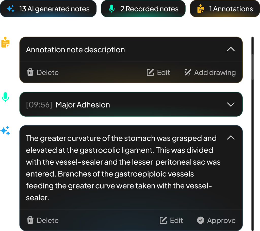
AI notes, voice recordings, and annotations — captured hands-free during surgery

“I need a clear picture of how Maestro is used throughout the day.”

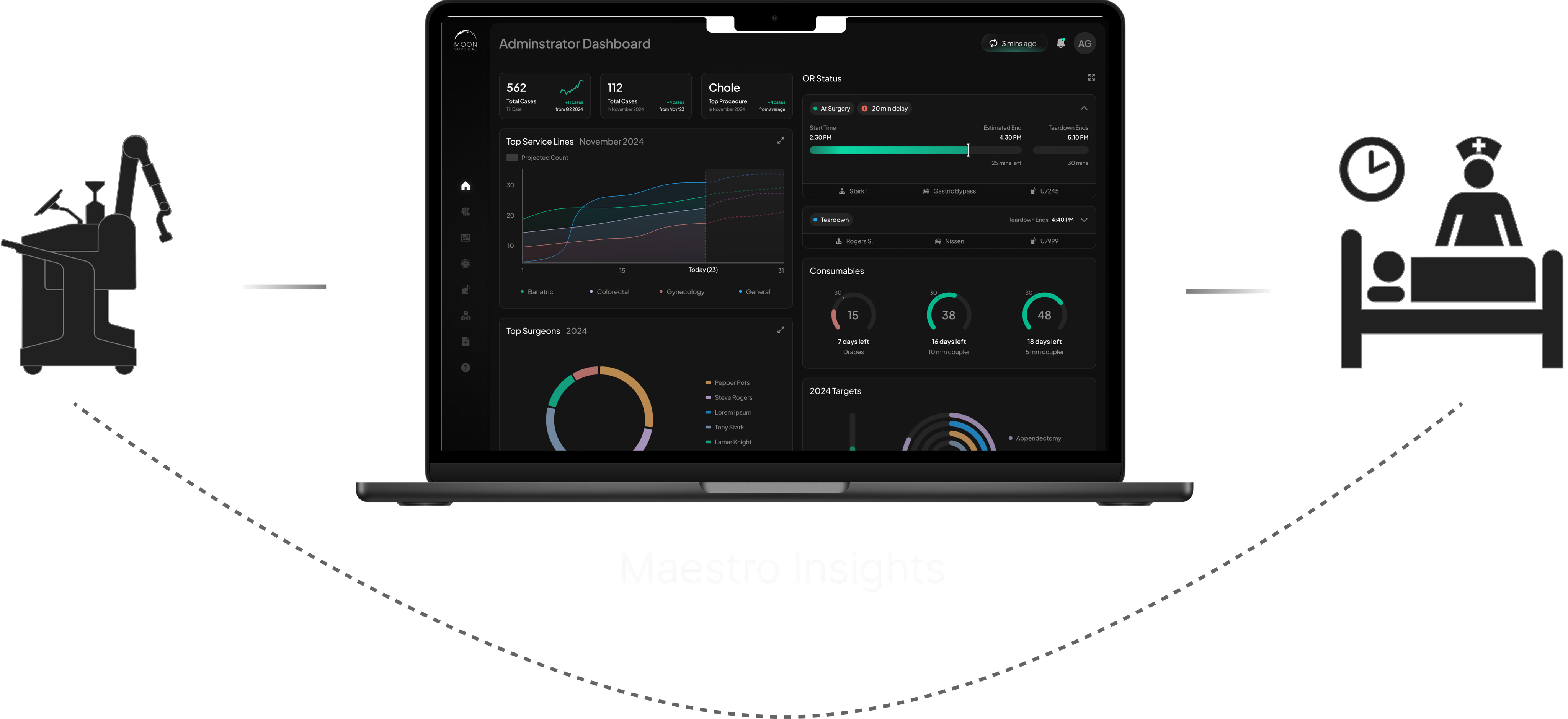
Admin Dashboard + OR Traffic Control

The admin side functions as a real-time observability layer for the entire robotics program. Administrators monitor site-wide performance — surgeon adoption, case volume, service line breakdown — and can drill into live OR activity as it happens.

Site-wide KPIs: surgeon adoption, case volume, and top service lines at a glance

OR Traffic Control is the real-time monitoring view. Each room shows live case status, timeline progress, staff allocation, and delay alerts — with a modal for drilling into active procedure events as they happen. The UI handles non-deterministic state: cases run long, rooms turn over unpredictably, and delays cascade.

OR Traffic Control with live case modal showing real-time procedure events

CONTEXT

The Robot Collects Data. Nobody Could Use It.

Maestro captures data through sensors and cameras during every surgery: timing, instrument usage, force, positioning. This data was supposed to power a feedback loop — surgeons learn from their cases, hospitals track adoption. But when I joined, the loop was broken. Surgeons got monthly PDF reports weeks after their procedures. By then, the context was gone.

Maestro Insights platform positioned between the surgical robot and post-surgery review, bridging the feedback gap

Maestro Insights bridges the gap — real-time data from the robot, reflected back as actionable insights

Two user groups needed this data for very different reasons. For this case study, I’m focusing on the surgeon experience — the research, testing, and design decisions that shaped how surgeons interact with their performance data.

🧑‍⚕️ Surgeons

Want to track their own performance, learn from each case, and improve their robotic technique over time.

🏥 Hospital Admins

Need to justify ROI, track robot utilization across the site, and manage OR scheduling around robotic cases.

RESEARCH

Understanding What Surgeons Actually Need

I ran three research tracks focused on surgeons to understand what they actually need from their data:

Contextual Inquiry

1:1 interviews and OR observations with surgeons and staff

Competitive Audit

MyIntuitive, VersiusConnect, Stryker — what exists, what’s missing

Remote Interviews

Surgical chiefs from partner hospitals across the U.S.

The research surfaced clear patterns. Three themes appeared across every conversation with surgeons:

Real-Time KPIs

“We need to see real-time value from the robot.”

Surgeons wanted per-case performance impact. Admins needed live KPIs to justify ROI and resource allocation.

Faster Visibility

“I want to know what’s going on without waiting weeks.”

Monthly PDFs were too delayed and too generic. Both groups needed on-demand access to make timely decisions.

Case-Level Insights

“I need to track case-specific patterns, not just time.”

Surgeons couldn’t drill into individual cases. They needed transparency across phases and usage metrics.

Feature Prioritization

I worked with the PM and team to map every feature request against impact and effort. We focused on what surgeons would use daily and deferred the rest:

Ship
Case Metrics Case Data
Next
Instruments Trends
Later
Scheduling
Not now
Outcomes LMS
DESIGN DECISIONS

Concepts We Explored

We considered three delivery formats for surgical insights:

Email Reports

Static, easy to ignore, no interactivity

PDF Reports

Monthly, generic, too delayed for decisions

Interactive Dashboard

Real-time, personalized, AI-powered

Design System

I built the design system from the Maestro brand kit — pulling colors, gradients, and iconography from the robot’s hardware identity and translating them into a cohesive UI system for screens.

Design system inspiration showing Maestro GUI v1.0 colors and brand kit reference

Brand kit to screen — color and gradient mapping from the Maestro hardware identity

TOKEN SYSTEM

Core tokens for the Maestro Insights platform — dark-first, data-rich, and optimized for clinical readability.

Background
#0A1A1A
Surface
#141414
Primary
#00B7C4
Success
#34D399
Warning
#FBBF24
AI / Insight
#A78BFA
Trend Lines
Bar Charts
Donut Charts
AI Insights
36
Components
6
Chart Types
10
Color Tokens
2
User Personas
THE PIVOT

Early Testing Changed Everything

We built out the dashboard concept into high-fidelity mockups and tested them with 11 surgeons:

Three high-fidelity dashboard concepts that were tested with surgeons

The dashboard concepts we scored — clean visuals, but surgeons didn’t find them useful

Surgeons scored the dashboard across three categories:

2.62
Feature Usefulness
3.94
Visual Clarity
4.46
Graph Comprehension

The graphs were clear. The visuals were clean. But usefulness scored 2.62 out of 5. Surgeons told us exactly why:

This feels more like something for data enthusiasts. I don’t see myself using it regularly.

I don’t have time to scan graphs or numbers. Just tell me what I need to know.

Looks better than MyIntuitive for sure, but it’s the same kind of data — and I don’t really use that either.

The Realization

Surgeons didn’t want data. They wanted insights. Charts and numbers are work — someone has to interpret them. I presented the findings to our CEO and CSO, and we pivoted from a data dashboard to an AI-powered insights platform. The LLM generates case summaries, surfaces what changed, and tells surgeons what to pay attention to. That’s what became Maestro Insights.

Before and after comparison showing the evolution from data-heavy dashboard to AI-powered insights platform

The pivot: from data-heavy dashboard to AI-powered insights

Post-pivot refinement: The pivot also meant evolving the design system. Charts, colors, and icons were all refined to support an insight-driven interface rather than a data-heavy one — shifting from dense graphs to clear trend indicators and AI-generated summaries.
IMPACT

Dec 2024 → Mar 2025. Three Months Live.

We measured across every hospital deployment for three months after launch.

58%
Increase in Maestro
utilization
19%
Faster case
completion rates
65%
Active users /
total users
5x
Growth in users
adopting Maestro

I actually check this after every case now. It’s the first tool that tells me what changed without me having to dig for it.

— Orthopedic Surgeon, partner hospital

The admin view finally gives us the data we need to justify expanding the robotics program to the board.

— Hospital Administrator, post-launch review

What’s Next

After three months live, surgeons and hospital partners started asking for more. Three directions emerged from post-launch conversations:

Real-Time Mobile App

Surgeons wanted insights in their pocket — performance data and AI summaries accessible between cases, not just at a desktop.

Gamification

Surgeons loved seeing their progress over time. They wanted milestones, streaks, and benchmarks to make improvement feel tangible.

Learning Management

The team wanted a full LMS — structured training modules so surgeons could systematically get better at using Maestro.

MY ROLE

Sole Product Designer

I was the only designer on the project. Seven months, from blank canvas to live product.

What I Owned

  • All user research — contextual inquiry, competitive audit, remote interviews
  • User testing — 11 surgeons, scored evaluation, pivot presentation
  • Information architecture and system architecture
  • Wireframes, high-fidelity design, prototyping
  • Design system — created from scratch, evolved post-pivot
  • Voice AI interaction design (“Hey Maestro” halo)
  • KPI definition and prioritization with data science
  • AI feature design — LLM case synopsis, trend detection

The Team

  • Moran — Product Manager (requirements, roadmap)
  • Emilie — Clinical Researcher (OR access, user recruitment)
  • Jefferey — CSO (business strategy, hospital partnerships)
  • Ritwik — Data Scientist (KPI modeling, data pipeline)
  • Tapforce — Agency developers (implementation)
REFLECTION

What I Learned

Seven months on a 0→1 product — including a mid-project pivot — taught me more than any redesign could.

Beautiful data is still just data.

We scored 4.46 on graph comprehension and 2.62 on usefulness. The charts were clear. The surgeons didn’t care. They needed someone to interpret the data for them. That’s why we pivoted to AI. I won’t confuse clarity with value again.

Low test scores are the most useful research you’ll get.

A 2.62 usefulness score felt like failure. It was the single most important number in the project. Without it, we would have shipped a product surgeons ignored. The discomfort of bad results is what makes them valuable.

Voice UI in an OR has no screen.

Designing “Hey Maestro” forced me to think about feedback without a screen. A pulsing RGB halo on the robot was the answer — organic, visible from across the room, and impossible to confuse with any other signal in the OR. Sometimes the best interface is light. If I revisited this, I’d explore haptic confirmation through the instrument handles so the surgeon doesn’t need to look away from the patient at all.